STARFLYER Total design for new airline
2005 - 2006
CD:Tatsuya Matsui CCD: Tatsuya Matsui, Motoi Nakamikawa
D: Motoi Nakamikawa, Kanako Homan
CL: STAR FLYER,Inc.
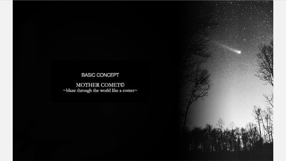
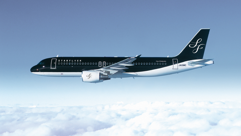
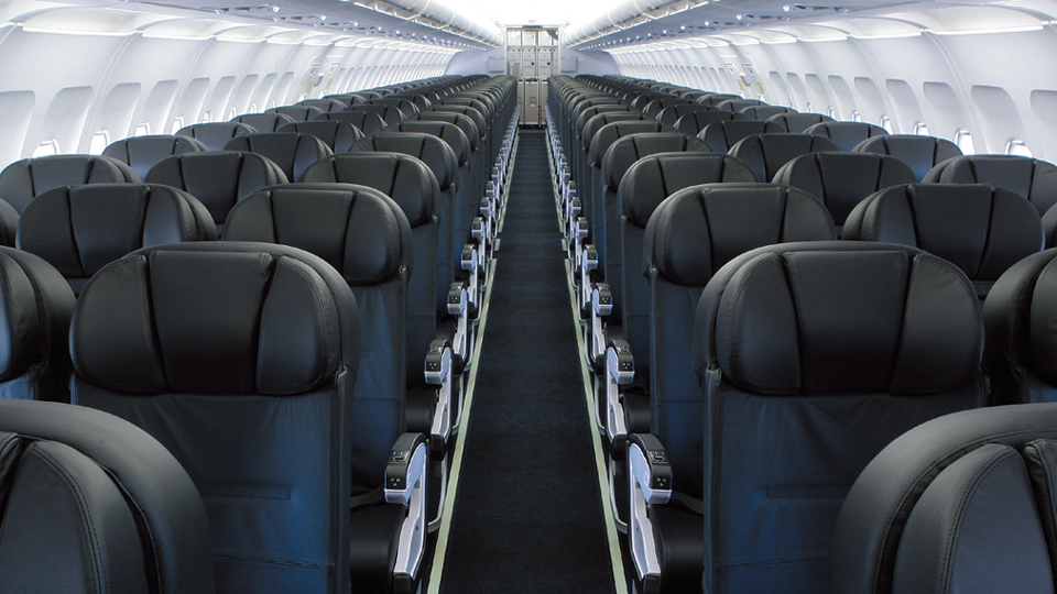
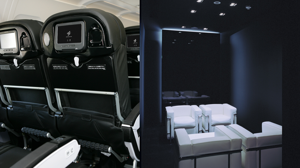
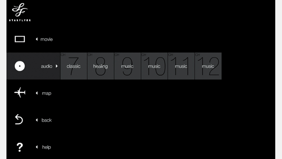
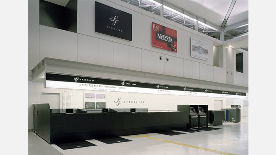
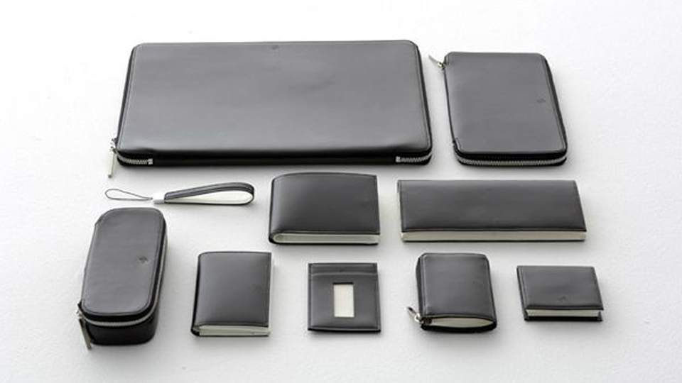
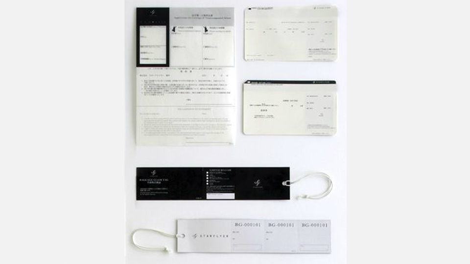
Star Flyer is a new airline company that was founded on December 17, 2002, just a century after Write brothers’ first flight on the Flyer. The company is based in Kitakyushu, an important industrial city in Japan, and it is an airline of a new business model. It was looking for a designer eighteen months before it started the service. The company consulted Eishi Katsura, an associate professor of Tokyo National University of Fine Arts and Music, who teaches design for the course organized by Kitakyushu city hall, and was introduced to us. First, before working on concrete plans, we carried out a thorough survey of airlines in the world. Then we conceived “Mother Comet” as its visual concept. It is the visual concept to be shared by everybody involved. Next was how to express the corporate principle “airline that is nowhere else.” We were sure that the most effective and immediate way to make people realize the existence of the airline would be to concentrate on how to build up the corporate brand through colors (visual information). We produced visually communicative modern design in “black + white” for which one finds no parallel elsewhere in the world (this is the most important) to emphasize a variety of fresh services and rules that the management came up with. We also made thorough design regulations and put them into effect. The feature of the airline is its logo design that symbolizes the city. We were devoted to the color, aiming to make “black” its brand. As a result, the image of the airline that we had at the beginning did not change a bit. On the day when the airline went into service for the first time, all employees looked up at the proud brave figure of a black airplane, and their minds were united. We are grateful for having this encounter and experience as designers. Star Flyer is a new airline company that was founded on December 17, 2002, just a century after Write brothers’ first flight on the Flyer. The company is based in Kitakyushu, an important industrial city in Japan, and it is an airline of a new business model. It was looking for a designer eighteen months before it started the service. The company consulted Eishi Katsura, an associate professor of Tokyo National University of Fine Arts and Music, who teaches design for the course organized by Kitakyushu city hall, and was introduced to us. First, before working on concrete plans, we carried out a thorough survey of airlines in the world. Then we conceived “Mother Comet” as its visual concept. It is the visual concept to be shared by everybody involved. Next was how to express the corporate principle “airline that is nowhere else.” We were sure that the most effective and immediate way to make people realize the existence of the airline would be to concentrate on how to build up the corporate brand through colors (visual information). We produced visually communicative modern design in “black + white” for which one finds no parallel elsewhere in the world (this is the most important) to emphasize a variety of fresh services and rules that the management came up with. We also made thorough design regulations and put them into effect. The feature of the airline is its logo design that symbolizes the city. We were devoted to the color, aiming to make “black” its brand. As a result, the image of the airline that we had at the beginning did not change a bit. On the day when the airline went into service for the first time, all employees looked up at the proud brave figure of a black airplane, and their minds were united. We are grateful for having this encounter and experience as designers.