GINZA TOTOKI
2013
CD: Tatsuya Matsui
Logo Design: Tatsuya Matsui
WEB Design: Tatsuya Matsui
Space Design: Tatsuya Matsui, Naoya Ito
CL: GINZA TOTOKI
WEB SITE : www.totoki.jp
The space where people enjoy their food speaks just as eloquently about the quality of the restaurant as the cuisine itself. Only when all in a restaurant is truly in harmony will its customers experience genuine comfort.
Through discussion with the restaurant’s owner and chef Toru Totoki, we were involved in all stages of the design of Ginza Totoki, from the planning of the new restaurant's concept to its actual design process.
The restaurant’s fundamental design principle was to create a natural-style restaurant, where guests could enjoy carefully selected natural ingredients at their leisure. It is from this point that our concept creation began.
The inspiration for Ginza Totoki came from restaurants found in art museums. Even by Japanese standards, Ginza has a high concentration of exclusive and tasteful spots. We interpreted this high concentration as an environment with a profusion of aesthetic genes, much like an art museum. The most important feature of restaurants in art museums is to provide a space that doesn’t make a statement. The key is to provide a plain, unfussy environment for the guests who have already been amply stimulated by the art they have taken in.
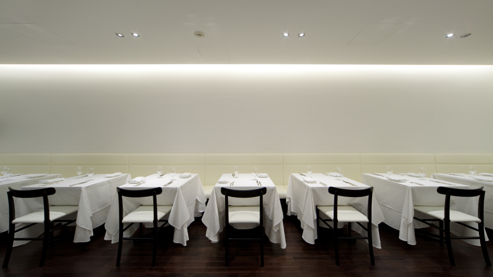
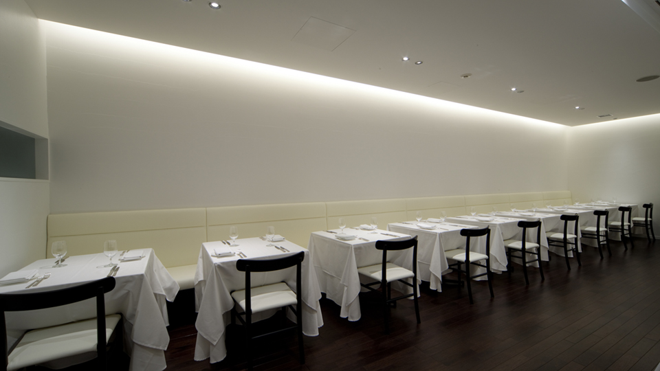
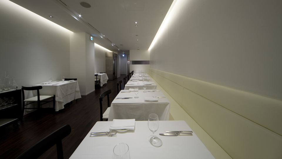
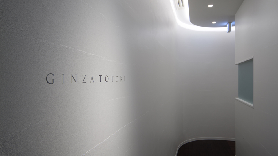
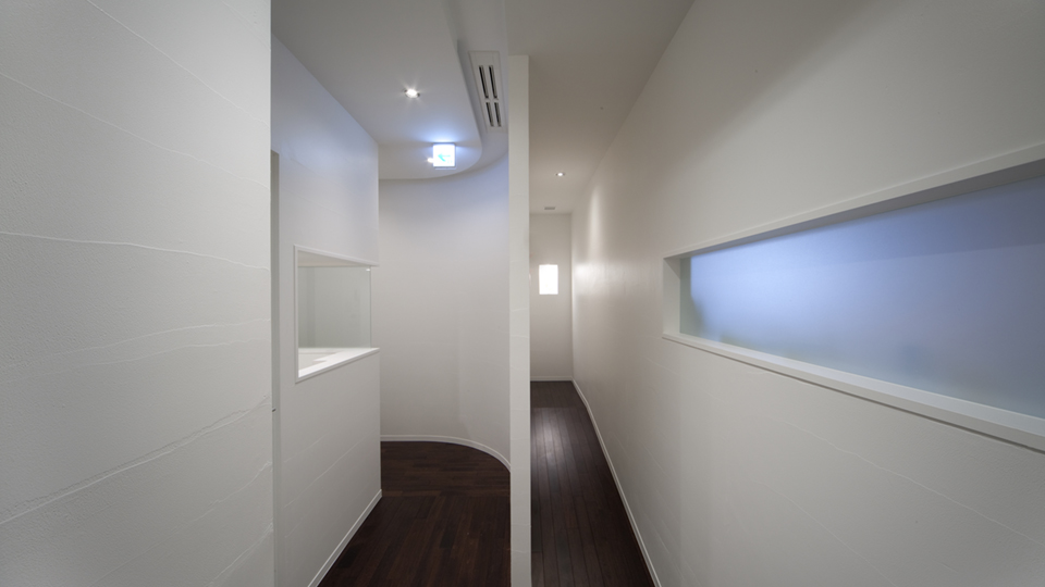
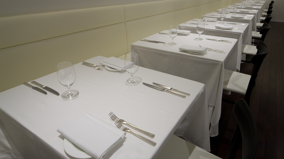
From the entrance of Ginza Totoki, the clean white wall sweeps round in a gentle curve, leading the customers to the dining area. The space is enveloped in natural, gentle light, based around the white tone. With each individual dish served in this natural-style restaurant, each diner's attention goes to the natural ingredients that are used to their greatest potential, presenting their beautiful natural colors. By eliminating all colors from the restaurant space except those of the meals and the drinks, customers can fully savor the beautiful gifts of nature that are lying on their plates. It is our hope that this leads to discovering how beautiful the colors created by nature truly are. We also used chairs by Jasper Morrison, especially commissioned in a color and material to best match the space. The chairs blend into the white space, contributing to the intentionally plain, unadorned atmosphere.
All this is so that guests might savor their food more intensely. In fact, the only colored objects in this space, other than the meals, are the flowers. To ensure that the concept of the space is fully realized, flowers are employed sparingly and to maximal effect. A vase with a single flower is placed on each table, allowing the customers to enjoy a hint of nature’s colors until their meal arrives.

